Mark this Date
Didn't really have anything to post today but was passing by Dean's when I saw this.

I am so hyped. How much? Hyped like Tigger on a sugar-high.
This reminds me of the debate over the different covers used by US and UK publishing houses for speculative fiction books, including genre fantasy books. UK publishers, to avoid differentiation, has been using rather stylistically fantastic covers whereas US publishers prefer covers that have the trademarks of genre fantasy, i.e. big-breasted women in armor, heavily-thewed men with swords, dragons, exotic settings, etc. Obviously, because of this, one can immediately spot a fantasy book on US shelves (or US books on bookshelves) as compared to UK shelves.
But I digress. More to the point, what I'm trying to say is that Dean's cover is aesthetically-pleasing to the eye and at the same time, quite different from the usual covers employed by local publishing.
In other words, this rawks.
(Sorry.)
Update October 29: Ooops. Rob just informed me that what I thought was one of the US cover for James Barclay's The Raven books was actually the original UK cover. Mea culpa. Anyone know the appropriate example instead?
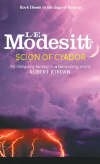
Update October 31: Ah, finally found a good example. Corrected this post accordingly. In this case, LE Modesitt is a US fantasy-writer. His Recluce books, about an on-going war between two groups of wizards, were published first in the US with these covers:

Later on, a UK publishing firm came out with another edition:
So, what do you think?
No comments:
Post a Comment