Pulp Pictures
I was reading a post over at gabe's about science-fiction and fantasy art and this struck a note in me. However, what I thought was in relation to cover art for fantasy and science-fiction books.
Now, I like diving into the secondhand bins of bookshops and sometimes I pick up a few SFF classics like Philip Jose Farmer, Leigh Brackett, or even Avram Davidson. You can probably blame my having been born in the wrong decade but such a find is normally a cause of celebration for me.

Personally, I don't really know the evolutionary/chronological process of the books' artwork. However, despite the flash and bang of modern artists like Stephan Martiniere or even by the late Keith Parkinson, there's something still to be said of the pulp artwork of yore. Moreover, a number of the classic SFF works seem to have art that are steps above the normal pulp artwork as evidenced by the book covers of David Lindsay's A Voyage to Arcturus or Mikhael Bulgakov's The Master and Margarita.


Granted, they're not mainstream covers but at least there's no hide nor hair of chain-mail chicks or elves in sight with these covers.
Moreover, there seemed to be more diversification in the kind of artwork used in those days, ranging from cats on an escalator (?) in H.P. Lovecraft's The Dream-Quest of Unknown Kadath, a very '70s look in Roger Zelazny's Lord of Light, and the almost Bosch-like artwork of E.R. Eddison's The Worm Ouroboros.


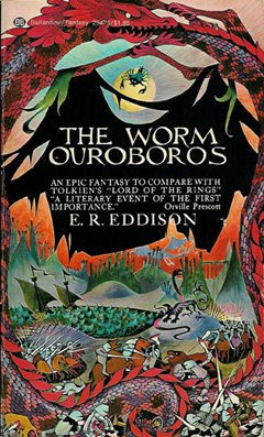
Pretty, no?
I know it would be unfair to compare the artwork of then and now. After all, I would presume the SFF publishing scene was quite different in those days when epic series meant a rather thick book instead of part umpteenth in the gazillion-ology of books.
Still, I see a certain beauty to the artwork then: something attached to the inherent pulp quality of the stories, when these science-fiction and fantasy books were magic portals to other worlds for those who were young enough to enjoy them.
No comments:
Post a Comment